Friday, October 15, 2021

Geometries and Difference in Parallel Play / Some Love Holds Water

Mary Schiliro's works on mylar in an installation view of Parallel Play, a jewel of a show uptown at John Molloy. The gallery buttresses its focus on Native American art with exhibitions of contemporary art that are consistently surprising, unexpected, and excellent.

Daniel G. Hill, Patricia Zarate (wall and shelves), Mary Schiliro. The themes are set up: weaves, light and shadow play, and decisive, one-shot paintings that require feats of engineering to pull off.

Daniel G. Hill: woven paper drawings and "fallen paintings" - both incised and then handled in economical but impactful ways--cut or woven.

Hill and Zarate, both members of American Abstract Artists.
The work is optical, subtle, exquisitely crafted.
Patricia Zarate paintings with a Jacob Cartwright drawing; his drawings were included in Mckenzie's Color Pencil Redux earlier this year. Zarate's paintings bring the language of signs indoors, transforming shapes into flowers-like forms that continue to evade specific readings.
Trilogy: Hill, Schiliro, Zarate. Cuts of various kinds, from literal shaping of the edge or reshaping interior to the abrupt color transitions in a drawing.
Hill's Fallen Painting, hypnotic in its transformation of fabric with precise cuts.

Equally hypnotic, cut and woven grids that rely, in part, on shadow play for structures that are simultaneously decisive and mutable.
A painting by Jacob Cartwright with sonorous color relationships within definitive geometry. The eye scrambles to organize pattern and the color harmonies aid and assist that despite unexpected variances.

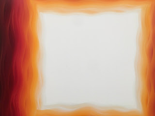
A miracle of brevity by Mary Schiliro, cut mylar "dunked" into pools of colors. At a small scale, it looks easy, but how do these two colors line up so flawlessly, and the paint adhere to the surface so perfectly?
Two details of a "dunked" and layered work approximately seven feet tall.
Light and shadow intersperse with pure color and geometry, spellbinding the eye.

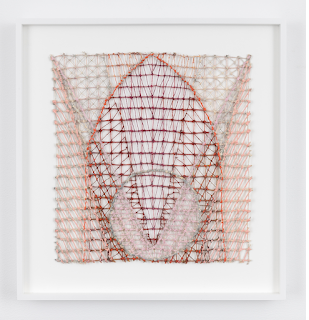
Julia Bland at Derek Eller in her solo exhibition Some Love Holds Water

This small textile drawings summon the geometries and all-encompassing compositions of Joseph Stella's Brooklyn Bridge paintings.

These images are clipped from the gallery website; I accidentally threw out my own.


The exhibition press release states the works "range in scale from intimate to monumental and encompass Bland’s lexicon of materials: canvas, linen, wool, dye, ink and oil paint. Canvas is pulled apart to become thread; threads are twisted together to become rope or braided into tassels. Raw wool is felted into blankets; blankets are cut up and quilted back together. Fabrics are woven on a hand loom, then twisted and torn, dyed and painted, washed and ironed, cut and sewn."
"There is a history behind the making of each artwork, and the materials themselves possess even richer past lives: wool comes from sheep; linen derives from the flax plant; found blankets, clothes, and upholstery all are imbued with personal stories. Even the geometric patterning has an origin. “Making is not really about following a certain process or tradition,” Bland writes, “but about the way all things change.”"


Insect forms, texture upon texture. 


Sunday, October 03, 2021

Modern Calligraphies: Jonathan Lasker at Green Naftali / Karin Davie at Chart

The Vagaries of Existence, 2002, in Jonathan Lasker's survey Born Yesterday: Drawing Into Painting, 1987-2020 at Gallery Link

Detail
Jonathan Lasker, To Love Infinity, 2001
Arriving NY in 1992, Lasker's paintings shocked me to the core, similar to fellow CalArts alum David Salle's that I absorbed in the Count Paza Collection in Los Angeles, circa 1985. A blunt, almost primal use of paint, utter disregard for standards from the past, has over time revealed a modern calligraphy that forms an aesthetic from lack of one. Like Franz Kline before him, Lasker composes in sketchbooks, enlarging the compositions to canvas. Outlining with grease pencil, he hires assistants to painstakingly paint them out, according to Erin Kimmel's fascinating essay in the accompanying catalog, which likens his vocabulary of line with "'pattern-seeing,'"a collapsing of vision and cognition into one another," conceptualized by visual theorist Gyorgy Kepes.

Reasonable Assembly, 2003
Scenic Rememberance, 2007
Bucolic Notation, 1989
Expressive Abstinence, 1989
Around the time I got to know Lasker's work, my husband started a job as paint maker for an artist brand.I shared some samples with a friend who worked for Lasker, convinced the paint would eclipse the Winsor & Newton paint he faithfully used. Though he tried the handmade paint, he preferred his paint consistent. 
American Obscurity, 1987
Objects Have Reasons, 2020
Picture With Outstanding Form, 2019
These paintings in some ways remind me of Christopher Wool--variations on the theme of process, the interiorization of city streets, maps, forms, windows, graffiti, dirt. Their enclosed shapes and frontal presence are deeply familiar in daily life.
Karin Davie in It's a Wavy Wavy World at CHART, her first NYC exhibition in fourteen years. The most recent exhibition at Mary Boone stepped beyond canvas with zipper works that mimic the undulations of her paintings, and the first exhibition in which I ever saw her work at Fawbush in Soho, featuring long, vertical paintings with curvy brushstrokes that seemed to protrude from the surface. Her colors then were deep blues and crimsons, with denser texture than the pthalo greens in While My Painting Gently Weeps No. 2, 2019. 

In the Metabolic No. 8, 2020 (60 x 60 inches for scale), shows the strategem of this show clearly. Soft gradations from a yellow-tinted white to deep alizarin crimson are woven, stroke by stroke, around the painting's perimeter. A thumb-like shape where she generally stablizes the canvas is removed and disrupts the square with an anthropomorphic echo of touch.

In the Metabolic No. 5, 2019, shows the subtlety of the woven paint in darker tone. 

Side Effects No. 3, 2018, 20 x 32 inches, shows the development of this woven stroke.
Known for ambitious, one-shot, wet-into-wet work that in the words of Wikipedia, present "an idiosyncratic take on the modernist stripe," Davie states in the exhibition catalog (available online), that the work in this show include "concepts of 60s edge painting, Minimalism and Process Art [that] have been humorously re-imagined. The iconic architecture of the 'square within a square' motif (i.e. Josef Albers) and suggestion of a metaphysical light at the end of the tunnel is transformed into a Pop-infused personal image that is both optical and visceral."
Cut paper collages in Chart's downstairs space recall the vertical compositions of her earliest work, in the woven motif of the new paintings.

These are incised and cut, similar to the zipper compositions in Davie's 2007 show at Boone.
It's great to see what Davie has been doing, observe the through-lines in the work and especially the deft weaves of juicy, supple skeins of oil. These are calmer paintings, more water-like, relating to minimalist concepts while introducing elements of landscape.  Like Lasker, Davie creates a world with a finite series of marks, but in terms of application and surface the RISD and Cal Arts graduates represent different generations. Lasker isolates, examines, and reconstructs the components of painting while Davie re-organizes them in a space that toggles between illusionistic and not. Both deploy a concise vocabulary and play, like a contemporary form of calligraphy, between flat and volumetric space.