 |
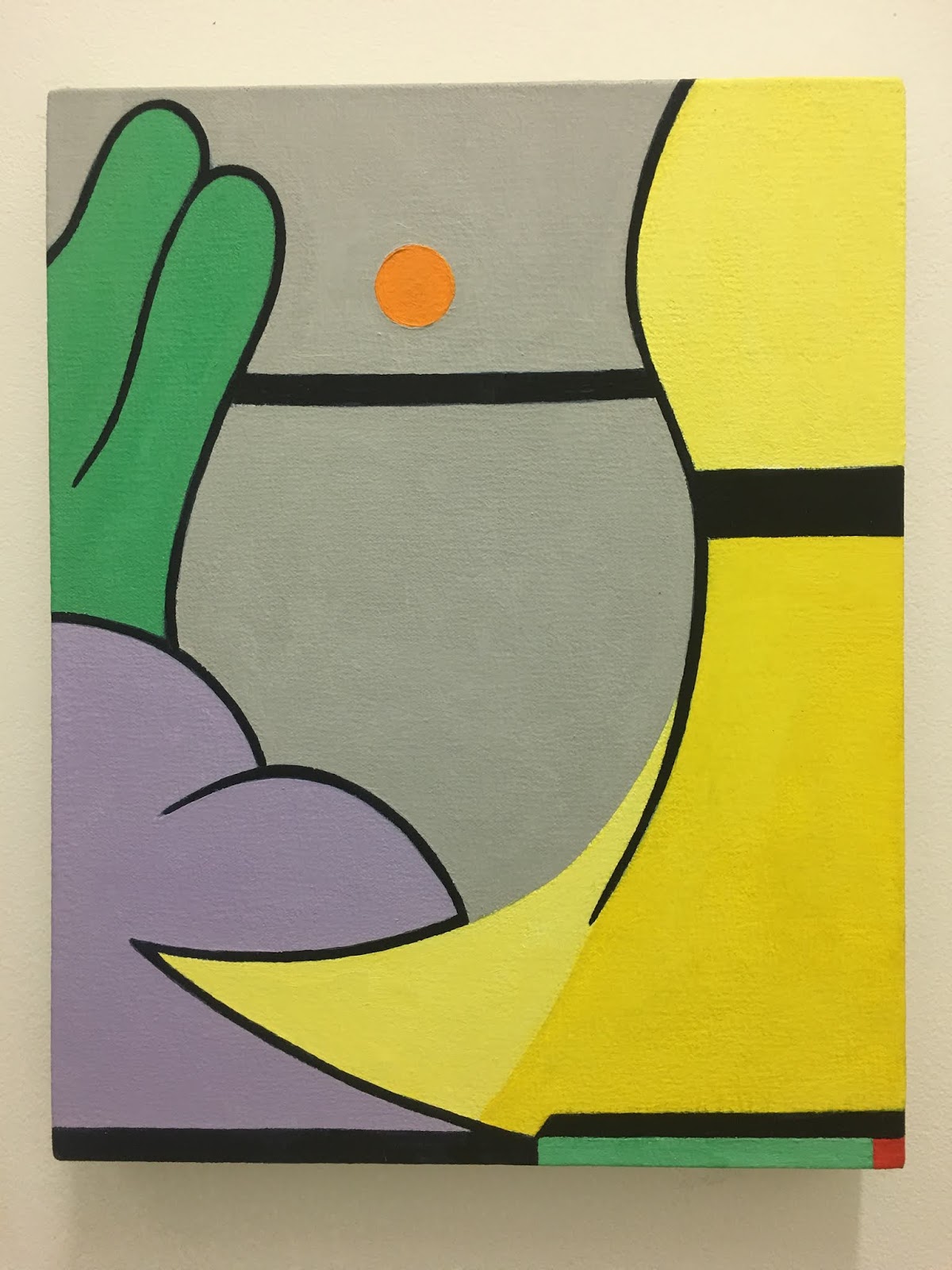
Arlene Slavin, Raj, 1972
We begin where the last post left off then assume descending order.
Swartz observes that "Arlene Slavin’s Raj of 1972 is typical of the early work in that it consists of overlapping layers in all-over repeated patterns. This work is oil on canvas and the artist has applied the paint in thin layers, utilizing the transparency for kaleidoscopic effects. There’s an obsessive quality to her surfaces. The grid has been manipulated in wholly different directions. The radiant colors and titles from this era come from the Persian miniature paintings, which combine elements of realism and abstraction. Slavin was included in the important “Ten Approaches to the Decorative” show of 1976 at the Tony Alessandra Gallery curated by Jane Kaufman. As seen in “With Pleasure: Pattern and Decoration in American Art 1975-1985”. One image is from the artist’s site to show the clarity."
|

 |
| Anne Swartz records the history: "Cynthia Carlson installed a version of her “Tough Shift for M.I.T” from 1981 at “With Pleasure: Pattern and Decoration in American Art 1972-1985” @moca She made the “wallpaper decoration” using pastry tubes, thus this large-scale painting directly on the wall flies in the face of the bombastic status mural painting, undermining its heretofore heroic status with decorations, repeat patterns, trompe l’oeil still life paintings, and domesticity. One radical aspect is the shadowy raw edge she leaves in evidence for the viewer, announcing “painted wall.” And it is an interesting gallery—Carlson’s work is shown alongside that of her artist friends—a sculpture by Barbara Zucker and paintings and a sculpture by Ree Morton. The first 2 photos are views, 3 is a quick video, 4 is an orphan flower on the gallery wall in the LA show, 5&6 are from the artist’s site showing the original installation at M.I.T., 7-10 are from the version installed in “Pattern, Decoration & Crime.” |


 |
| Swartz continues in her astute grasp of history that, "These are works by Faith Ringgold, an important painter in contemporary art. She is not typically associated with P&D, but these pieces are included in the @moca “With Pleasure: Pattern and Decoration 1972-1985” because she hybridized non-western forms into her work, utilized quilting (her mother’s), and incorporated repeat patterning. They are 3 of the 20 paintings from The Windows of the Wedding series (#4: Man, #13: Mother, #10: Family). They were emancipating, permitting her greater freedom. For them, she utilized the shape of the Tibetan thangka—rectilinear painting surrounded by fabric, (she used quilted), in hanging scroll format. The repeated triangles come from African Kuba cloth, interestingly, where women manage textile production (matrilineal society). She once said the design originated from a now-lost Kuba language of 8 triangles inside a rectangle. She said she wanted to make a language “meaningful to her.” They were exhibited as accompaniments to figurative sculptures of married couples (penultimate image is a view of last year’s ACA Gallery show in that format). Apparently at the Serpentine Gallery show in London this summer, they exhibited several in a row similar to LA installation (last image)." |


 |
| Swartz: "Parts of Joyce Kozloff’s great P&D-era installation—her reckoning with world decoration—“The Interior Decorated”. The first six slides are from “With Pleasure: Pattern and Decorarion in American Art 1972-1985” @moca and the next three are from “Pattern and Decoration: Ornament as Promise” @mumok_vienna. When @whitneymuseum has its big Joyce Kozloff show, they need to include in the budget to bring the floor over from Europe. We’ve got to see it all back together. The parts are called small silks, long silks, pilasters, and Tut’s Wallpaper. The last two slides on view in the German/Austrian/Hungarian show are studies. The pilasters were the only P&D showing in WACK: Art and Feminism (2005-07)." |

 |
| Please note: the images may not be in the same order as the text. Consult Facebook for proper order. |
 |
| "Valerie Jaudon, Bellefontaine, 1976, metallic pigment and oil on canvas in “With Pleasure: Pattern and Decoration in American Art 1972-1985. The second image I pulled online since mine weren’t great. She said she took the grid and turned it on itself in infinite variations, while drawing from all kinds of patterning and decoration in other cultures. Her surfaces vibrate with all those kaleidoscopic, interpenetrating lines and forms. " |


"Lynda Benglis, Lagniappe: Bayou Babe, 1977 @moca. She had mid-70s shows of decorative-oriented works such as this one, like outsize jewelry. I like what the artist said in 2018 about decoration. Lynda Benglis, interviewed—artnet, Margaret Carrigan, 06/05/18. INT: Homemaking is a culturally loaded term as it has definite gender-specific connotations that relate to women and their role in society. Are you linking homemaking with creative expression at large? LB: I’m interested in this idea of decoration. Years ago, at the height of Minimalism, a well-known critic said to me, “Lynda, your art is so decorative.” And I said, “What’s wrong with decoration?” That was around the time Barbara Rose coined the term “ABC Art” to describe art being stripped to its bare bones, and that idea just didn’t go with decoration. But I was looking at stuff like Frank Stella’s work and I didn’t see a huge difference between the two. He was interested in things like graphics and symbols and how those are reductive, but those things can be repeated visually, flattening their meaning out and turning them into something like decoration. INT: Well, you essentially made the definitive link between decoration and Minimalism. Your latex floor pours and amorphous sculptures all operate in the same vein as other Minimalist works like Donald Judd’s cubes and Carl Andre’s grids in that they are experiential rather than narrative. Unlike their work, however, which is very muted in appearance, yours is shiny, sparkly, and sometimes even glow-in-the-dark. I dare say, you bedazzled Minimalism. What interested you about those materials? LB: Like I said earlier, it’s an animal thing. We’re inherently attracted to shiny, sparkly things. Our eyes are honed by millennia of evolution to see them. But as we become increasingly socialized, we’re taught to limit our appreciation for glitter. I grew up with sparkly things, like my dance baton and my bright pink girl’s dance costume, and I loved those things. I still do. Why should what we’re naturally drawn to be conditioned out of us?"
 |
| "These are several of the seven works by Barbara Zucker in the “With Pleasure: Pattern and Decoration in American Art 1972-1985”. The {final} image is Blushing Bride of 1977, her joke about Duchamp’s bride—now reduced to a pink flocked fan and pipe. Then there are six fabric/doorknob works (I didn’t get all unfortunately). She was included in the 1977 “Ten Approaches to the Decorative” at Tony Alessandro Gallery, curated by Jane Kaufman (the last image is her work above Joyce Kozloff’s statement from that show). Zucker’s mostly known for inventively transforming simple objects (sometimes playfully or humorously). Further, she’s an important presence in the Feminist Art world and was one of the AIR Gallery founders, a significant feminist art space. The art is decorative, and the installations are ubiquitous (up and down, with the Blushing Bride appearing prominently twice in the exh cat). Great to have another woman artist on view and will build more of an audience for the work." |

 |
| Barbara Zucker's Blushing Bride, 1977 |
 |
| "Miriam Schapiro, Barcelona Fan of 1979 on view in “With Pleasure: Pattern and Decoration in American Art 1972-1985” is one example of her femmage, or feminist collage which she named with artist Melissa Meyer in an article in famed Heresies magazine, which stemmed from her championing of decoration. She saw it as a way out of the patriarchal domination of the art world, antithetical to her interests. The shape, the materials (incl glitter!), even the way she used collage (like decoupage) tested artworld presumptions. There’s much more there, so much more. " |

 |
| "I wish I had better pictures of this room of Kim MacConnel paintings, painted sofa, lamp, and table at “With Pleasure: Pattern and Decoration in American Art 1975-1985”. The “Collection Applied Design” 1976 show was his big breakthrough exhibition, based on the Chinatown ad book of the same name he’d used for source material. His playful lines and bright colors remind me of Matisse, but there’s also Mexican tiles and more there. The last image is “Please Disturb Room 1105” from Thomas Solomon Art Advisory’s room at the 2019 Felix Art Fair in LA to show where the artist would go with some of his domestic installations. I think that crazy rug was in Holly Solomon’s apartment." |
 |
| Kim McConnell |


