 |
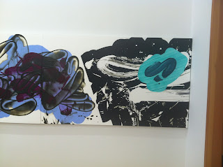
| A lovely Sharon Horvath in Drishti, A Concentrated Gaze. 1825 Avenue of the Americas Art Gallery in partnership with Jones Lang LaSalle. Curated by Elizabeth Heskin and Patricia Spergel. Exhibition Link |
 |
| Tracy Miller's cake paintings. Haven't seen these in a long while. |
 |
| Detail, Tracy Miller. Unfortunately a guard prevented me from taking more photographs. and pointed me to the excellent, free catalog. But that doesn't help a blog. I made my best argument, but no photography. There is excellent coverage on Facebook, however. One place to start is the exhibition FB page, which features a lot of sneak peaks: https://www.facebook.com/events/1092283400836222/ |
 |
| Onward to David Reed at Peter Blum. Here, a color study in the back room, detailing notes for the large, scroll-like group of paintings up front. Exhibition Link |
 |
| From the press release: "An extensive group of color studies and working drawings that document the artist’s working process accompany the show." |
 |
| Moving to the front room |
 |
| Gorgeous slices and overlays of paint |
 |
| The working drawings |
 |
| Starting right to left, like a scroll. Reed does not refer to Chinese painting as a resource, but so many comparisons with this work - the gestures as islands within space... |
 |
| the way larger masses |
 |
| give way to lighter gestures, opening and closing. |
 |
| The subtlety of opaque, white layers |
 |
| Lightness and heaviness |
 |
| A matrix of markmaking |
 |
| resinous halos around the blue marks, as if they'd been painted on glass and transferred to the canvas |
 |
| The stencils build up in the middle, the impasto in the negative areas |
 |
| Then, lightness - barely there |
 |
| Really loved these white top layers slicing through the diaphanous marks |
 |
| The entire painting. See gallery link for good installation shots of this. Still thinking on these paintings days later. They are so perfectly made. |
 |
| Then to David Findlay Jr. Gallery for Lucy Mink's exhibition. |
 |
| Her twisting and folding of space with a light touch of the brush and unique, neutral-with-pure color combinations continue in this new work. Click here for a PDF catalog of the show: http://www.davidfindlayjr.com/assets/2016.04-lucy-mink-ecatalogue.pdf |
 |
| The references in these paintings are infinite. |
 |
| One thinks of the Chicago Imagists: space inverting on itself. And early American painters such as Hartley, Dove. |
 |
| Sensitive touch with a nearly violent wresting of planes |
 |
| The painting in the back is lighter, a la Michael Berryhill - the man at the gallery mentioned Lucy Mink had been thinking about watercolor |
 |
| This work relies though on the interface between brush and surface so the translation to oil takes some doing. |
 |
| Here is a detail showing her approach. |
 |
| There is definitely light inside these marks. |
 |
| Offsetting the neutral opaques that give such shape to the space. (These words sound so dry, but the paintings do take you to a magic space). |
 |
| Uptown to Dubuffet at Acquavella. Spectacular!!! Exhibition Link |
 |
| emphasizing rocks. |
 |
| Black Beauty, November 1945. The painting is much richer to the eye with surprising, shiny turquoise areas amidst the deep, rich blacks. |
 |
| Detail. The painting is roughly 28 x 23 inches. Collection Michael Chow. |
 |
| July 1959. Combat Beard. Oil on canvas. Roughly 31 x 39. Collection National Gallery, Washington, DC. |
 |
| Metallics... |
 |
| This show is a spectacular followup to MoMA's Dubuffet show of prints last year: Soul of the Underground - print show at MoMA |
 |
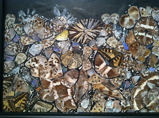
| Butterflies |
 |
| Figure |
 |
| Overall compositions |
 |
| Landscape |
 |
| Paper mache head |
 |
| Detail of a surface - Dubuffet |
 |
| Detail of an Eric Fischl at Skarstedt. The show is called Rift Raft. Exhibition Link |
 |
| The painting further back. He makes some effective visual splices that recall Deborah Brown's new works incorporating canonical artworks with portraiture, using the disparity to cut through space. |
 |
| His use of black surprised me. |
 |
| Not easy to see in this image, but the shapes of those figures on the left of the painting loom strangely in real life. The black is often just flat on the canvas. It's odd, and disturbing. |
 |
| Fischl is a bit of a Manet - an introverted social chronicler. |
 |
| Interesting to see a brushy painter address push and pull. |
 |
| A bit dashed off but some beautiful spatial plays. Makes me wonder about the role of speed in image. Would like to see this next to a Rosenquist, for example. |
 |
| Flat black again. Eric Fischl at Skarstedt. |
 |
| Trudy Benson at Half Gallery. http://halfgallery.com |
 |
| In that, they are one-offs layered, like an operating system. Looking through one screen of simple, clear color to the next. Question: Is the orange a pale flourescent or not? I thought so. |
 |
| Strange spackling gestures and dry, brushy marks - texture of dryness very pleasing. Through materials, a commentary on the cheesy 1980s ethos some of us remember as children, others as young adults. |
 |
| Trudy Benson at Half Gallery. |
 |
| Howard Hodgkin at Gagosian. The show is called, from Memory. This painting would have been great linked with Emily Berger's painting from the Drishti show (a blue striped painting with bare wood on left side, which I could not photograph and is not on the artist's web site). I would like to see them together, both oil on wood, oil playing with the surface of the wood as an alternative material. Exhibition Link |
 |
| Downstairs, a poetic Christopher Wool, one of the most delicate I've seen. Then a guard told me no photos, completing the circle. |


No comments:
Post a Comment