 |
| Katia Santibanez at Morgan Lehman. Gallery Link This exhibition shows a new direction that moves beyond the linear marks of earlier works to denser, textile-like patterns painted on absorbent grounds that render the surface matt and flat with a delicate touch. |
 |
| The color, with more neutrals, has become chromatically fuller over the years. |
 |
| Here, a detail from a larger painting. At the opening there were too many people to gain distance from the work, but check link above or better yet just go to the show! |
 |
| Arlene Sheshet at Sikkema Jenkins. Gallery Link |
 |
| Such odd, pleasing configurations, like signage, or pre-historic forms. |
 |
| Markers of a private logic. |
 |
| This totem heralds the visitor's entrance. |
 |
| And carries associations to caves, mountains, green walls and construction sites.. |
 |
| Stanley Lewis at Sidecar (Betty Cunningham). Gallery Link |
 |
| With a second show at the New York Studio School. Gallery Link |
 |
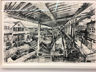
| I've always loved these drawings, approached with a ferocity that suggests piercing the atmosphere with charcoal sticks and literally imbedding it into the surface. They are so physical. |
 |
| What looks like a simple view... |
 |
| Is hard-won in layers of dense build-up of ink and graphite and gnarled pulp, as marks accrue and vision forms. It's old-school, and it's good. |
 |
| There is something so primal and satisfying about drawing directly from the motif. |
 |
| The embodiment of gesture does not fail to convey meaning. |
 |
| Gouges and layers. |
 |
| Things pieced together. |
 |
| This interior recalls Gideon Bok's work: Artist's Blog |
 |
| Cecily Brown at Drawing Center. Surprisingly fresh to see her large scale sketches after Hogarth and others, such as Breughel. Love the soft pink wall! Gallery Link |
 |
| Perhaps it is the merger of subjective and objective modes in play. The best of Brown's drawings maintain a light touch and interpenetration between medium and paper, as well as |
 |
| space and value, keeping forms open and color local, glazed with wash. |
 |
| In the back room, Olga Gernysheva, a Moscow-based visitor to New York last November. Her show was surprisingly wonderful, capturing sights normally unseen. Gallery Link |
 |
| Retail, seen in terms of landscape. |
 |
| The most beautifully rendered drawing of all. I didn't think charcoal on watercolor paper would yield much, but the broad marks balance the paper texture. |
 |
| Though formally the drawings are interesting the best part about them is the new, even absurd perception of daily western life. |
 |
| Loie Hollowell at Feuer/Mesler. Gallery Link |
 |
| Weird, rounded scribbles adorn visually sculpted surfaces, like body hair. |
 |
| The paintings are described in terms of duality of body and landscape, homages to artists Judy Chicago and Georgia O'Keefe. |
 |
| Taut paintings, filled sexual tension and compositional precision. |
 |
| Forms literally built out from the surface, creating nooks and crannies. |
 |
| Sun and Moon |
 |
| Patterns in Body and Place |


No comments:
Post a Comment