Tuesday, April 02, 2013

A Chelsea Tuesday (March 26, 2013)

Basquiat, using a similar opaque covering technique to Pollock and the early Frankenthaler, taken before the guard told me to stop photographing. Gagosian's Frankenthaler and Basquiat exhibitions are not to be missed. I do not have words for Frankenthaler, it pushes me to the studio--but in both exhibitions a relationship to Pollock and his surrealist floating script that both contained and floated above figures (as in She-Wolf) was surprisingly evident and informative.

Check Two Coats of Paint (listed right) for excellent coverage on Frankenthaler, including this approach.

Jim Lee, form a strong group show at Edward Thorp: Painting Advanced.
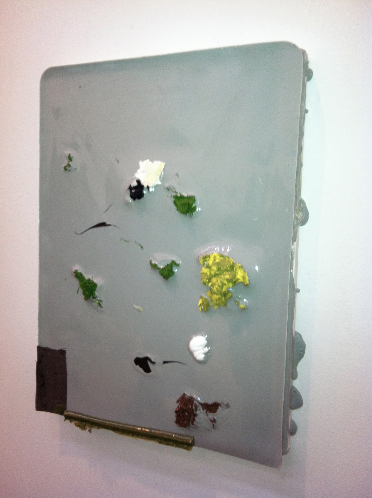
What on earth is this magical concoction?


Jim Lee, Detail

 Andrew Spence, one of several, beautiful paintings that with an economy of means create bracing optical illusions.

Andrea Belag's sweeping gestures evoking spaces of the mind.
Edward Thorp's site has lovely images of these paintings.

Belag

Rachel Malin, an artist new to me. Her work initially recalls Amy Feldman's.

This is a particularly wonderful Malin, two systems merging as one. In Thorp's front room, to left.

Gary Stephan. Clear, direct latticework of the brush--makes you feel it through your body.

Al Held at Cheim and Read. The sheer scale of this work is invigorating, also vertiginous.

The abundance of paint and odd cropping of letter forms feel immediate and germane.

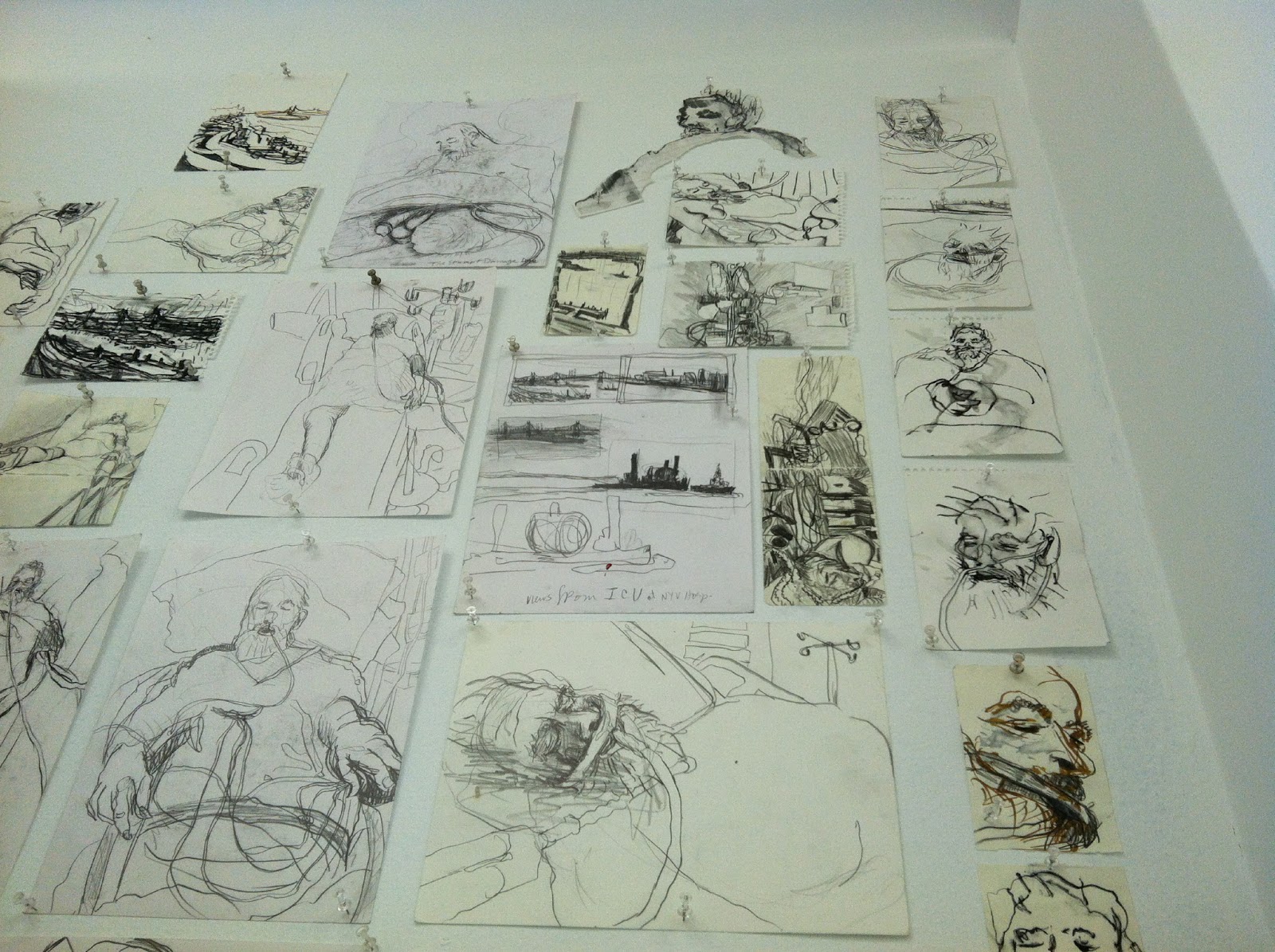
Susanna Heller at Magnan Metz. Drawings show her process of building mark to evolve images.

Susanna Heller, painting from her show Phantom Pain, which she identifies not only as an
affliction suffered by her husband, but also society in general.

Walls of drawings: hospital drawings and ....

Landscape drawings.

There is a beautiful article by Oliver Sacks in the NY Review of Books on hallucination,
which speaks about phantom pain.

The hand reveals  the anguish as well of the joy of being alive.

Surface detail.

Heller has said she puts paint down, like a step on the ground (she is an avid walker, logging huge distances across the city)


Behind the desk at Magnan Metz. Susanna Heller: a beautiful show.
This painting is a small summary of the acuteness that resides in fully present experience.

Barkley Hendricks at Jack Shainman, his first with the gallery.
I saw his epic exhibition at the Studio Museum in Harlem, in 2008.
What a shape-maker! Crazy compositions, inspired by the Italian Baroque.

For some time, Hendricks has focused on Jamaican and other landscapes where he travels and paints.
The newer, figurative works as above, reveals a shift in technique from the earlier figure paintings.


Hendrick's love for shoeswas also apparent in the Studio Museum show.

The figures appear less clarified, more scumbled as a result of increased use of a heavier,
gloss medium, but the love of local detail carries through.

Detail--Hendricks can be so precise.

Barkley Hendricks Landscape

Their basic shapes contain more paint handling and detail than one initially imagines.
Hastening to see  Frankenthaler on 20th St., I missed Mary Jones' compelling paintings in her studio exhibition on 26th St., documented here: maryjonesstudio.blogspot.com. I've known and admired Mary's work for years, since we first met in Los Angeles I don't even remember when. Mary Jones has long been a great abstract painter, her approach filled with buoyancy and edge.I'll never forget her work in the show Baroque Geometry in 1988-9 at Marlborough Chelsea with Dona Nelson, Karin Davie, Stephen Ellis, Judith Hudson and Stephen Mueller.
Mary Jones. Front Porch Dreamer, 2012. oil, feathered wallpaper, spray enamel on canvas, 11 x 14 inches.
Another Mary Jones, 2012, with Swarkovsky crystals, roughly the same size as above. Wish I'd seen these.

Sunday, March 24, 2013

Saturday Late on the Lower East Side

I AM MY WORLD explores the specific depiction of the exterior self, either visage, body, or interior persona materially manifested, to create an accrual of images and myths of the self.” David Gibson, Curator 
Rebecca Morgan, two portraits

My favorite one for its density, and wild-eyed quality

Elisabeth Lund, morphing through a variety of identities.
Iris print with ink on top by Pippip Ferner
John Tomlinson and Samira Abbassy: unexpected urban and folk perspectives.
Lots of sculptural and photographic imagery with sets + people/dolls/ puppets interacting.
Loved the fake quality in this triptych by Hilde Frantzen, which nods to three lurid masked-protagonist photos by Sara Tandero and Tine Isachsen and a strange Christina Dallas photo/installation across the room. This show by Gibson pairs Norwegian and NY artists and offers surprise combinations of works that tease eye and brain--as if looking in a mirror and seeing someone who is the unruly, raw, playful and open version of you.

Rochelle Feinstein at On Stellar Rays, two paintings, generously factured thought-ideas,

and two more, a humorous combination of photograph + facture, harking back to an aesthetic from an earlier time--black and white film Caligari-style, plus 1960s and 1970s video works, happening documents...

A wonderful surprise, the mylar orb inside the window,
"I Am My World"...

Wednesday, March 20, 2013

Philip Pearlstein at St. Petersburg Fine Art Museum, FL

Philip Pearlstein's survey exhibition: an especially wonderful insight into the life of one painter in an intimate and unexpected venue, the Museum of Fine Art, St. Petersburg, FL.
Link to article by Lennie Bennett in the Tampa Bay Times: Things To Do: Philip Pearlstein


One of the Pearlsteins. The gallery's main room had a breathtaking wall, this one of three on same.

Pearlstein's compositional ambition reverberated throughout the room, echoing history painting from the past.


Above: Ingres, Poussin
Pearlstein's flatfooted approach unleashes a passionate temperament for composition. In painting after painting, he documents the stillness within the studio-cavern, laid bare by raking light and panoramic views. Pearlstein's innate feeling for rotation imbues the space with unexpected arabesques, twists and turns giving 'push and pull' new vibrancy.

Monday, February 25, 2013

Sharon Butler: Precisionist Casual at Pocket Utopia

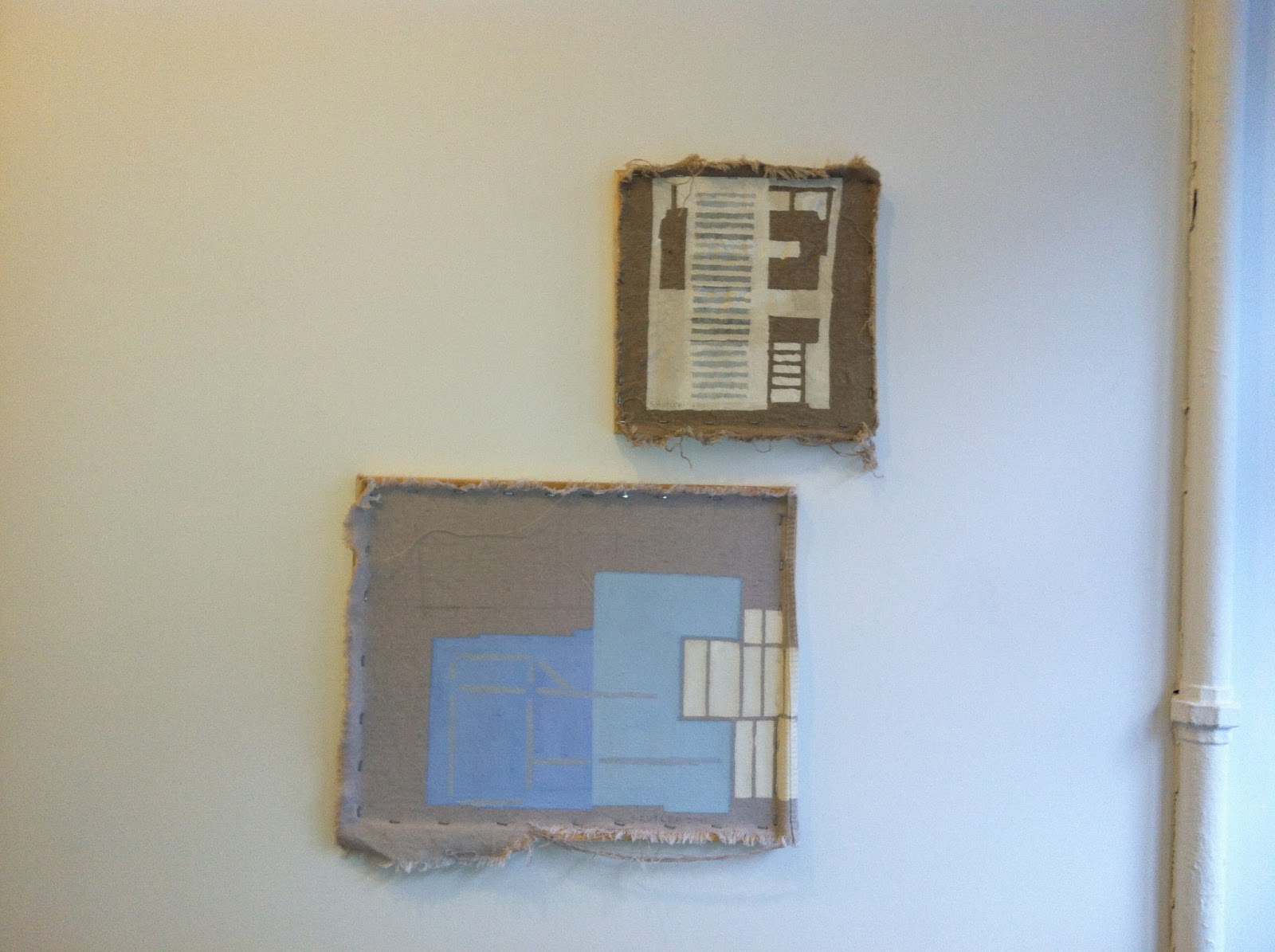
By Pocket Utopia's entrance, right: small beauties. The exhibition title conflates the precisionist approach of early modernist painters such as Charles Sheeler with a recent focus on (de) material and (non) finish, in what Butler dubbed New Casualist.
Finish becomes a gestalt of the whole, bringing all elements into play, those surrounding as well as in the work. The ruddy, exposed stretchers against cool-hued shapes and linen create a frisson between texture and material. The bottom thread of the canvas became a gorgeous, pivotal element offsetting the weave, geometric elements and color blocks in this painting.
A view of the show for scale and sequence. Note wrinkled edges--becoming formal elements within the work.
Definitions of finish and painting are challenged within a simple decision to stretch or not stretch canvas.

More color-in-material. Butler's signature is included as a visual element.

More traditional than others but smoky and beautiful.

Metallic paint and staining. Immersed in historical and contemporary applications of pouring paint,
I can't help but love this one for its lightness and historical referent. Recently Stephen Maine attributed staining paint to both James Brooks and Helen Frankenthaler. Staining engages the fusion of surface and ground, sought after in late modernist painting. Butler's painting adds urban concerns such as graffiti, sealer and the industrial shapes one espies on a rooftop.


The corners feel nearly overdone yet without them, would the painting address the same issues?


Butler's exhibition is also featured elsewhere:
Joanne Mattera
http://joannemattera.blogspot.com/2013/02/canvasing-neighborhoods.html
and
Thomas Micchelli for Hyperallergic
http://hyperallergic.com/63349/when-paintings-come-apart-sharon-butler-on-the-inside-out/

Congratulations, Sharon Butler!

Tuesday, February 19, 2013

Juicy Paint

Brett Baker at Elizabeth Harris: DETAIL of his work's thick, striated surfaces and surprising color shifts

Missed his recent show but two paintings hung by the desk at the gallery.
The red one was equally beautiful with hints of copper, but iPhone couldn't pick it up.

Josette Urso at Kathryn Markell, a joyous exhibition. Urso's beautiful view in her Bushwick loft inspires her surprising tonal shifts and plays of the brush. I enjoyed the strange, cool color of this painting.
See another Urso if you scroll down.

Peter Wayne Lewis, who divides his time between northeast US and Beijing, in the 2012 Beijing Biennial.


The real thing at Skoto, also on 20th St. Skoto was a find: it features Jamaican artists' work.
The vibe was Salon-like, with conversations blooming in all directions, which is why I didn't photograph more.
Lewis works large, sometimes serially and there are also some lovely watercolors in back.

Inspired by and erudite in jazz, Lewis' marks suggest Chinese ink painting.

What in Chinese calligraphy is referred to as a "crossover"--
the brush jumps over paper to get to the other side of a mark, Lewis achieves with a scraper, it looks like.

Cora Cohen at Guided by Invoices, at the corner of 21st and 11th. What an absolutely gorgeous show.
iPhone photos can't do justice to the subtle, swiped surfaces and layers of graphite and oil.

Josette Urso at Markel: a buoyant snow painting with odd, checkered lozenge shape.

Preview of Jennifer Wynne Reeves at BravinLee Programs, a quirky, intimate and beautiful show.

Cora Cohen: ruddy painting, with gold and copper notes.

Jennifer Wynne Reeves: relishing material.

Fearless navigator of all things visceral.


And again.

She's been working on these paper pieces for a while.


Raggedy Ann's Foot will need to migrate to a new server. Until then patience is appreciated.

Warm and Cool in Chelsea and Midtown

 Deep Cuts at Anna Kustera
Liz Markus at Deep Cuts, curated by David Humphrey and Wendy White at Anna Kustera on 21st St.
Read more about it, and see the full show, at the link above. Plus, good curator photos at KCLOG (link to right on this page).
I love this image in tandem with Morris Louis and the Kasmin show in the previous post.

Peter Saul at Mary Boone on 57th.
I have loved his work since his 2010 survey at Haunch of Venison, which featured crazy, ambitious history paintings.


Nikki Maloof at Deep Cuts

More Saul...can you imagine.

What makes these images so pungent are dainty, methodically applied marks and internal scale at a perfect pitch.

Down the hall at McKee, a Guston drawing and painting.

Harvey Quaytman at McKee.

Blogger no longer loads images in order. So here is Saul--a particularly beautiful one.

The detail of Quaytman that wants to accompany the image of his painting.